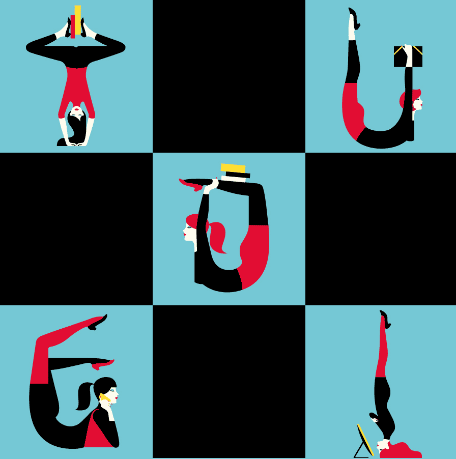
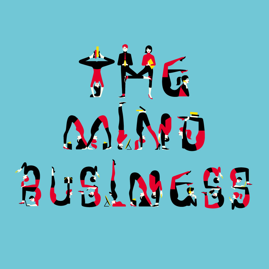
Been bored out of your mind by being in an office all day? Want to learn visual communication but think your surroundings is too boring or conventional to spark creative interest? This beautiful collection of a human alphabet made from office workers offers a delightful example of how artists see design everywhere.
We have been a huge fan of London-based French illustrator Malika Favre. In this particular illustration for Financial Times, she uses simple human forms and everyday elements from an office to make a minimalist yet dynamic alphabet.
When we teach the visual alphabet in our ImageThink visual learning workshops, we ask our participants to try to boil everyday objects down to simple shapes, and to identify a variety of shapes in our environment.
This is also true from Malika Favre’s artist statement:
“My approach to illustration is about paring things down as much as possible.
I try and get to the essence of my subject by using as few lines and colours
as it needs to convey the core of the idea.”
We hope you enjoy this as much as we do, and see more of Malika’s work here on her website.


